

|
Project Overview
This project, titled Publike Dialogen, was part of a university course but involved working with a real client. The objective was to design a mobile application that enhances public deliberation by making it more accessible and user-friendly.

The client

The platform Publieke Dialogen (Public Dialogues) results from ongoing research by group Civic Technology at The Hague University of Applied Sciences.They aim to stimulate and facilitate discouse between citizens, local officials, and politicians. Their platform offers a place for dialogue and various tools to support it, through brainstorming, collecting information, polling, collective writing, and more.
My Role
My role was to translate the existing online web platform into a mobile app format and document my decisions in a detailed Design Report.
Project Rundown
This project lasted about 5 months, with around 8 hours of work per week—and additional, regulary scheduled meetings with the client.
Design Process
Desk Research
I started this project by familiarizing myself with the topic, using desk research. I asked myself the following questions:
What is public deliberation?
Are there already existing public deliberation platforms?
What are important features for these platforms?
Are there any already existing opinions about public deliberation platforms online?
Deepdive into the already existing publike dialogen website.
Goals and Values
To stay on track with this project I decided to write down my goals and values for this project:
Keep existing, familiar features and colors, but don’t be scared to improve or change an element if necessary
Use universally accepted, easily recognizable design elements
Put a big focus on Accessibility, design for everyone
For mobile design prioritize speedy quick interaction, and comfortable thumb movements
Work mostly with my own pace and solve problems on my own, but get feedback at key steps in the design
Information Structure
When converting the structure of the website to mobile, the horizontal nature of the phase layout with the expanding tabs proved to be the biggest challenge. Additionally the many layers of information made it hard to achieve my goal of allowing users fast and easy interactions.
An important early step was writing down the hierarchy of information, at this point I had my own names for these levels:
Project Level (Short description, Image)
Topic Level (Short description, Image)
Phase Level
Module Level
Chat (or other module)
This view allowed me to quickly and efficiently ideate about how this structure can best be translated into a mobile design.
Lo-Fi Wireframes
The process of Lo-Fi wireframing helped me a lot to precisely define what every page, Tool would look like. Without the burden of choosing colors, font, filler text, Lo-Fi wireframing allowed me to explore ideas quickly.
This is also where I had added ideas, and potential improvement possibilities to the tools, like the Canvas Tool, or Call- Channels, During Call Chat, Notes tool, Grid Chat and more.
Visit the ->Figma File
Site Map
I created a Sitemap to showcase the information architecture and hierarchy of pages and features of the Public Deliberation Mobile App
Full Site Map ->Figma File
Final Design
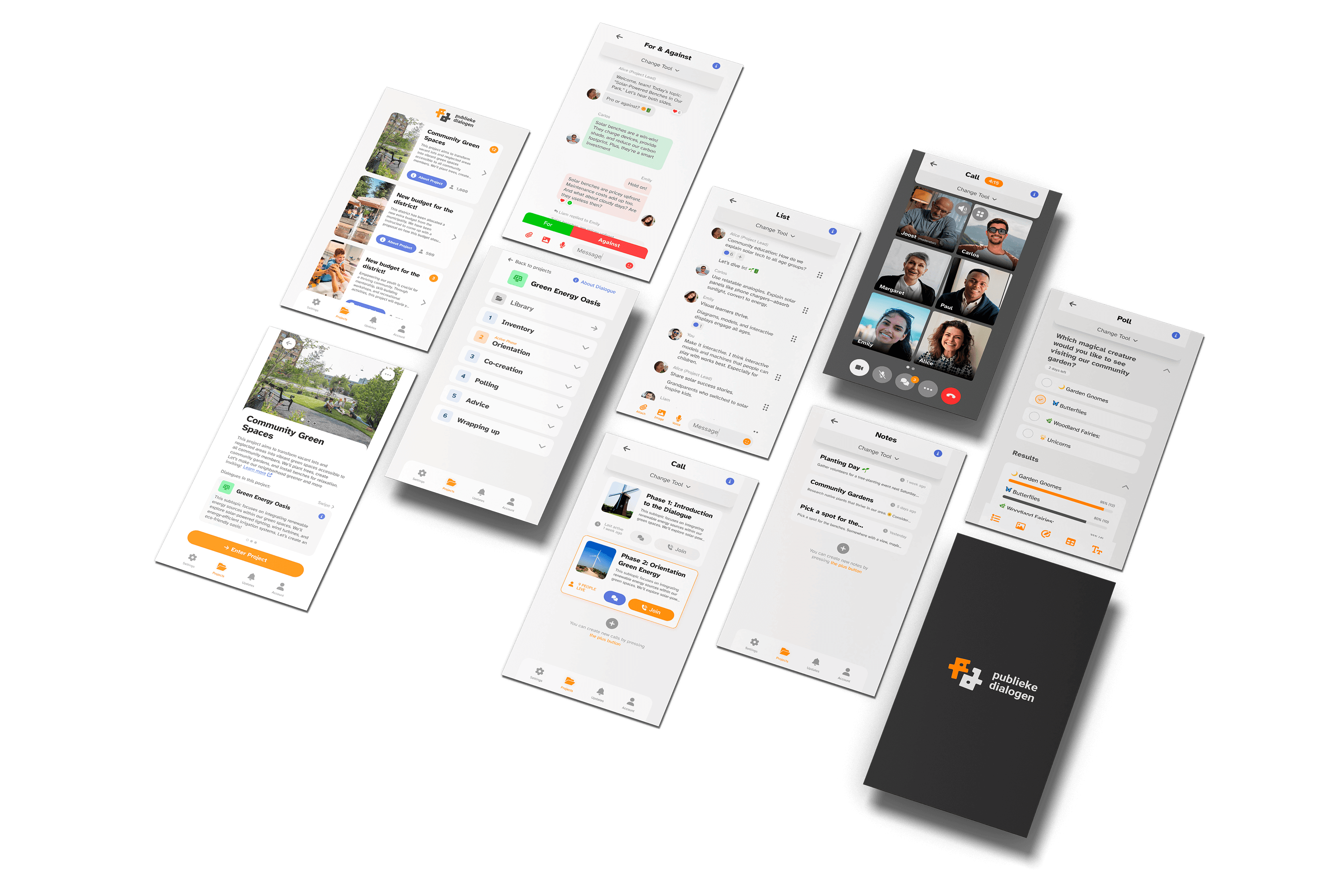
Going from Lo-Fi to Hi-Fi, the first step was to establish a visual style for the app.
As for the Typeface I decided to go with: Atkinson Hyperlegible.
The typeface is named after Braille Institute founder, J. Robert Atkinson. What makes it different from traditional typography design is that it focuses on letterform distinction to increase character recognition, ultimately improving readability. So it is perfect for an app that is for everyone. This also works towards my goal of making the app very accessible.
The colors used in the app stem from the colors of the website, with small changes. I have added a new Accent color to aid the Primary orange, and lighter more desaturated version for both primary and accent.
To ensure my designs are in line with today's design standards I used a lot of inspiration from already established big apps like (Facebook Messenger, Whatsapp, Zoom, Teams …). This ensured the usability and recognizability of the features.
After many hours of designing, I had a final design with some basic prototyping.
Visit the ->Figma Design
Feedback and Refinement
Feedback from tutors and peers was crucial in refining the design. I incorporated suggestions to improve the distinction between tools, enhance navigation, and address accessibility features. User testing provided valuable insights into the app’s hierarchy and navigation, leading to final adjustments that ensured a seamless user experience.
My Thoughts
This was one of my favourite university projects. I got to learn a lot about completing a project from start to finish.
The following are the steps of my project: Research->Ideation->Lo-Fi Wireframes->Hi-Fi Wireframes->Clickable Prototype->User Testing->Completed Design
The final results were very well received by the client, it was a very successful project.

